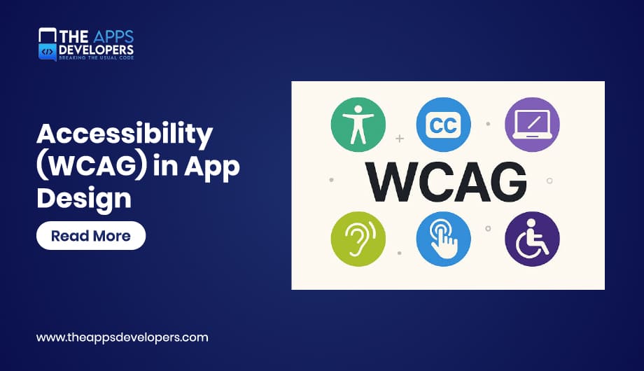
WCAG accessibility in app design means building mobile apps that people using screen readers, switch controls, and other assistive technology can actually use, measured against the Web Content Accessibility Guidelines and increasingly required by law. It covers color contrast, navigation, text sizing, and error handling, and in 2026 it’s no longer just a best practice for most businesses operating in the US or EU. It’s a compliance requirement with real deadlines attached.
Those deadlines just shifted, too, which is exactly the kind of detail a lot of accessibility content hasn’t caught up with yet. Below is what WCAG actually requires for mobile apps, what changed in the legal landscape this year, and the practical steps that get an app genuinely usable, not just technically checked off a list.
What Is WCAG, and Why Does It Apply to Mobile Apps?
WCAG stands for Web Content Accessibility Guidelines, a set of standards published by the W3C that define what makes digital content accessible to people with disabilities. Despite the name, WCAG applies well beyond websites. Mobile apps fall under the same guidelines, and in both the US and EU, WCAG conformance is now the reference standard that regulators point to when defining what “accessible” legally means for an app.
The Four POUR Principles
Every WCAG guideline traces back to four core principles, often shortened to POUR.
Principle | What It Means for App Design |
Perceivable | Users must be able to perceive content through at least one sense, sight, sound, or touch. Alt text, captions, and sufficient contrast all fall here. |
Operable | Every interactive element must be usable through multiple input methods, not just touch. Keyboard and switch control navigation matter here. |
Understandable | Content and navigation should be predictable and clearly labeled, so users aren’t guessing what a control does or where a flow leads. |
Robust | Content needs to work reliably across assistive technologies, current and future, which is largely a matter of using standard components correctly rather than custom-built ones that break screen readers. |
WCAG 2.1 vs. WCAG 2.2 vs. WCAG 3.0: What Actually Applies Right Now
Confusing these three versions is one of the more common mistakes teams make when scoping accessibility work.
Version | Status | What It’s Actually Used For |
WCAG 2.1 | Current legal baseline | The version referenced by ADA Title II and the EU’s EN 301 549 standard for the European Accessibility Act |
WCAG 2.2 | Published, technically current | Adds success criteria focused on cognitive accessibility and mobile use cases; widely treated as best practice even where it isn’t yet the legal minimum |
WCAG 3.0 | Still an incomplete working draft | Being developed by the W3C with a conformance model that will look quite different from 2.x; not referenced in any current US or EU regulation |
The practical takeaway: build to WCAG 2.2 where you can, since it’s the more complete and mobile-aware standard, but know that WCAG 2.1 Level AA is what regulators are actually checking against right now.
The Legal Landscape in 2026: ADA, EAA, and What Actually Changed
ADA Title II Deadlines Just Got Extended
Here’s the detail: a lot of accessibility content published even a few months ago is going to get wrong. The Department of Justice’s original rule set an April 24, 2026 deadline for state and local government entities serving 50,000 or more people to meet WCAG 2.1 Level AA. In April 2026, the DOJ issued an Interim Final Rule pushing that deadline back a full year, to April 26, 2027, with smaller entities now given until April 26, 2028. You can read the actual rule directly in the Federal Register’s published extension if you want the primary source rather than a secondary summary. The extension applies to public entities specifically, and it doesn’t touch private-sector Title III exposure, where accessibility lawsuits have continued climbing regardless of any government deadline.
The European Accessibility Act Is Already Enforceable
Unlike the ADA extension, the EAA isn’t giving anyone more time. It’s been enforceable since June 2025, and 2026 is the first full year EU member states are actively supervising against it, covering mobile apps alongside websites and a range of other consumer products and services, per the European Commission’s own EAA overview. The compliance standard is EN 301 549, which incorporates WCAG 2.1 Level AA, with an updated version expected to bring in WCAG 2.2 sometime this year. If your app serves EU users, this isn’t a future deadline to plan around. It’s already active.
Practical WCAG Guidelines for Mobile App Design
1. Color Contrast That Actually Passes
Text needs a contrast ratio of at least 4.5:1 against its background for standard text, and 3:1 for large text, under WCAG’s AA level. This is exactly why building contrast requirements into your design system’s semantic tokens from the start beats trying to audit and fix contrast issues screen by screen after the fact.
2. Full Keyboard and Switch Control Navigation
Every action available by touch needs an equivalent path through external keyboard or switch control input, since not every user can rely on a touchscreen gesture. Focus order should follow a logical, predictable sequence, not jump around the screen in a way that leaves someone lost.
3. Screen Reader Support Done Properly
Every interactive element needs a meaningful accessible label, not just visual styling that sighted users can interpret but a screen reader has nothing to announce. Custom components built without proper accessibility APIs are consistently where screen reader support breaks down, which is part of why the Robust principle matters as much as the more visible ones.
4. Touch Target Sizing
Interactive elements need to be large enough for users with limited motor precision to tap reliably, generally in the range both Apple’s and Android’s own platform guidelines already recommend for general usability. Accessibility and good general UX design overlap here more than people expect, which is a theme covered more broadly in our mobile app UI/UX design best practices guide.
5. Resizable, Reflowable Text
Users need to be able to increase text size significantly without content breaking, overlapping, or getting clipped. This ties directly back to the text-expansion planning covered in localization work, since a layout that survives a 30 percent size increase from translation tends to survive a font-scaling accessibility setting too.
6. Clear Error Messages and Form Labels
Form fields need visible, programmatically associated labels, not placeholder text that disappears the moment someone starts typing. Error messages need to explain specifically what went wrong and how to fix it, not just flag that something did.
7. Reduced Motion Options
Users sensitive to motion, including those with vestibular disorders, need a way to reduce or disable non-essential animation. Both major platforms expose a system-level setting for this, and a well-built app respects it rather than overriding it with hardcoded animations.
Why Automated Testing Alone Isn’t Enough
Automated accessibility scanners are useful for catching a first pass of obvious issues, but they only catch roughly a quarter to a third of actual WCAG problems. Contrast ratios and missing alt text are easy for a scanner to flag. Whether a screen reader announces a custom component in a way that actually makes sense to a real user is not. Manual testing with real assistive technology, not just an automated audit, is what closes that gap, and it belongs in the same conversation as the broader mobile app testing practices covered elsewhere in this series.
Common Accessibility Mistakes in Mobile App Design
Relying on an overlay widget or automated scanner as a substitute for real fixes is a big one, and it’s increasingly recognized by regulators and disability advocates as something that doesn’t actually deliver compliance. Treating accessibility as a final QA pass instead of a design requirement baked in from the start is another, since retrofitting proper contrast, labeling, and navigation into a finished app is a much larger job than building it in from day one. Building custom UI components without the underlying accessibility APIs wired up is a quieter mistake that often doesn’t surface until a real screen reader user tries to use the app and can’t.
How Accessibility Connects to the Rest of Your App
Accessibility isn’t a separate feature bolted onto a finished product. It’s shaped by decisions made during Mobile App Development planning, tied closely to the same design system and component work that determines everything else about how consistent an app feels. It also increasingly overlaps with legal and compliance obligations covered in our mobile app security best practices guide, since both are becoming baseline expectations rather than optional extras for apps operating at any real scale.
How The Apps Developers Approaches Accessibility
We build accessibility into the design system and component architecture from the start, not as a compliance checklist run right before launch. That means contrast, labeling, and navigation decisions get made alongside the rest of the UI/UX design work, not layered on top of it after the fact. If you need to bring an existing app into WCAG conformance, or want accessibility built in properly from the start of a new one, we’re glad to help figure out what that actually takes.
Conclusion
WCAG accessibility in mobile app design has moved from a nice-to-have into a legal and competitive baseline, and the rules keep shifting under teams that aren’t tracking them closely. Build to WCAG 2.2 where you can, treat automated scanners as a first pass rather than a finish line, and bake accessibility into the design system instead of bolting it on before launch. It’s also simply better design. An app that works well for someone using a screen reader tends to work better for everyone else too.
If you need to bring an app into WCAG conformance, or want it built accessibly from the start, get in touch. We can walk through what your specific app actually needs.
Frequently Asked Question
Is WCAG legally required for mobile apps?
Increasingly, yes. In the US, ADA Title II requires WCAG 2.1 Level AA for state and local government entities, with deadlines recently extended to 2027 and 2028. In the EU, the European Accessibility Act has been enforceable since June 2025 and covers a broad range of private-sector apps and services.
What's the difference between WCAG 2.1, 2.2, and 3.0?
WCAG 2.1 is the current legal baseline referenced by most regulations. WCAG 2.2 adds newer criteria focused on cognitive and mobile accessibility and is widely treated as best practice. WCAG 3.0 is still an incomplete working draft and isn't referenced in any current US or EU regulation.
Does an accessibility overlay widget make an app compliant?
No. Accessibility experts and disability advocacy organizations broadly agree that overlay widgets don't deliver real compliance, and their presence can actually signal to regulators that the underlying product wasn't built accessibly in the first place.
Can automated tools fully test WCAG compliance?
No. Automated scanners typically catch only a quarter to a third of actual WCAG issues. Manual testing with real assistive technology, like an actual screen reader, is necessary to catch what automated tools miss.
Does building for accessibility slow down app development?
Not if it's planned from the start. Retrofitting accessibility into a finished app is a substantially bigger job than building contrast, labeling, and navigation requirements into the design system and components from day one.