- Home
- App Development
- Blog Details
- 12 mins read
Wireframe vs. Prototype vs. Mockup: Key Differences
- Published on:
- Written by:
- Share:
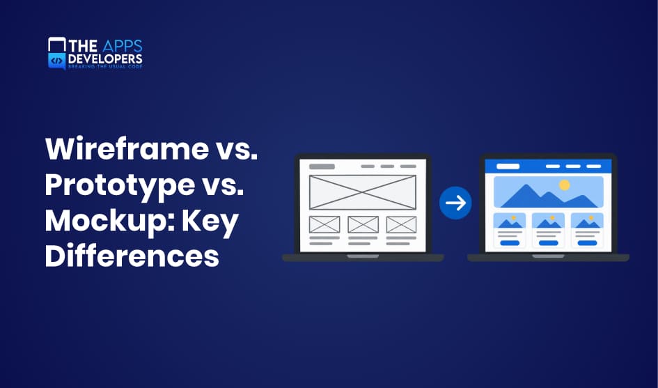
Wireframes, mockups, and prototypes are the three core deliverables in UI/UX design. A wireframe maps the layout, a mockup shows how the product will look, and a prototype shows how it will work. Each one answers a different question at a different cost.
Mixing them up leads to real problems: stakeholders approve colors before the navigation works, or developers build screens nobody has tested. This guide explains the wireframe vs. prototype vs. mockup differences, when to use each, and how they fit together, so your team can reduce risk before writing a single line of code.
What Are Wireframes, Mockups, and Prototypes?
All three are representations of a digital product, but they differ in detail, purpose, and interactivity. Think of them as a blueprint, a rendered photo, and a model home you can walk through.
Wireframe: Defining the Layout and Structure
A wireframe is a simple, usually grayscale sketch of a screen. It shows where content, buttons, images, and navigation will go, using boxes, lines, and placeholder text. There are no brand colors, real images, or final fonts.
The goal is to settle the information architecture: what goes on each screen, in what order, and how users move between screens. Because wireframes are quick to make and easy to change, they invite honest feedback on structure instead of style.
Mockup: Visualizing the Final Design
A mockup is a static, high-fidelity image of what the product will look like. It adds the visual layer: color palette, typography, icons, real images, spacing, and brand elements.
Mockups help stakeholders approve the look and feel and give developers exact visual specifications. However, a mockup is not clickable. It shows a moment in time, not how the product behaves.
Prototype: Testing Interactions and User Experience
A prototype is an interactive simulation of the product. Users can tap buttons, open menus, and move through screens as if the app were real, even though no backend code exists yet.
Prototypes focus on interaction design and usability. They let you test whether users can complete key tasks, find features, and understand the flow before development begins.
Example: A Food Delivery App
Imagine designing the ordering flow of a food delivery app:
- Wireframe: Gray boxes show a search bar at the top, a list of restaurant cards, a filter button, and a bottom navigation bar. The team debates whether filters belong at the top or in a separate screen.
- Mockup: The same screen now has the brand’s orange accent color, real restaurant photos, star ratings, delivery times, and the final font. Marketing approves the visual style.
- Prototype: Testers can tap a restaurant, add a burger to the cart, adjust quantity, and reach checkout. The team discovers that users miss the cart icon, so it gets moved before development starts.
Wireframe vs. Prototype vs. Mockup: Key Differences
The short answer: wireframes define structure, mockups define appearance, and prototypes define behavior. The table below compares them side by side.
| Factor | Wireframe | Mockup | Prototype |
| Purpose and design focus | Layout, content hierarchy, information architecture | Visual design, branding, look and feel | Interactions, user flows, usability |
| Visual fidelity | Low; grayscale boxes and placeholder text | High; final colors, fonts, images | Low to high, depending on the stage |
| Interactivity and functionality | None (static) | None (static) | Clickable; simulates real use |
| User testing and feedback | Internal feedback on structure | Feedback on visual appeal and brand fit | Usability testing with real users |
| Deliverables and stakeholders | Sketches or digital frames for designers, product managers | Pixel-accurate screens for clients, marketing, developers | Interactive files for testers, stakeholders, developers |
| Time and development effort | Hours to a few days | Days to weeks | Days to several weeks |
1. Purpose and Design Focus
Each deliverable answers a different design question. A wireframe asks, “What goes where?” It focuses on information architecture, content priority, and navigation paths. A mockup asks, “How should it look?” It focuses on visual identity, readability, and brand consistency. A prototype asks, “Does it work for users?” It focuses on interaction design, task completion, and the flow between screens.
This is why reviewing the wrong deliverable at the wrong time causes confusion. Asking a client to judge navigation from a mockup often turns the meeting into a debate about colors.
2. Visual Fidelity
Visual fidelity is how closely a design matches the final product. Wireframes are deliberately low fidelity: gray boxes, simple lines, and placeholder text such as “Product title here.” This keeps attention on layout.
Mockups are high fidelity. Every pixel reflects the final interface, including colors, fonts, icons, images, shadows, and spacing. Prototypes sit anywhere on the scale. An early prototype can be clickable wireframes, while a late prototype can be indistinguishable from the real app.
3. Interactivity and Functionality
This is the clearest dividing line. Wireframes and mockups are static images: you look at them, but you cannot use them. Prototypes are interactive, so users can tap buttons, scroll lists, open menus, fill in forms, and move between screens.
A prototype still has no real backend. Data is simulated, payments do not process, and search results are pre-set. It imitates functionality closely enough to test behavior, without the cost of building it.
4. User Testing and Feedback
The type of feedback you can collect depends on the deliverable. Wireframes generate internal feedback from designers, product managers, and developers about structure and missing content. Mockups generate opinions on visual appeal, brand fit, and readability, usually from clients and marketing teams.
Only prototypes support real usability testing. You give a user a task, such as “Order a pizza and pay with a saved card,” and watch where they hesitate or fail. That behavioral evidence is far more reliable than opinions about static screens.
5. Deliverables and Stakeholders
Wireframes are mainly working documents for the product team: designers, UX researchers, product owners, and technical leads who check feasibility. Mockups are presentation and specification files for clients, executives, marketers, and front-end developers who need exact visual values.
Prototypes serve the widest audience. Testers use them, investors understand them quickly, and developers use them to see how screens connect, what each interaction does, and which states (loading, empty, error) must be built.
6. Time and Development Effort
Wireframes are the fastest to produce and change, often minutes per screen. Mockups take longer because every visual detail must be decided and kept consistent across screens. Prototypes take the most effort when they include detailed transitions, multiple user paths, and edge cases.
The effort is an investment, not overhead. Every issue caught in a wireframe or prototype is one developers do not have to rebuild later.
How Wireframes, Mockups, and Prototypes Work Together
The three deliverables build on each other, with each stage adding detail only after the previous one is validated. A typical workflow looks like this:
- Wireframe: Agree on screens, content priority, and navigation.
- Mockup: Apply the visual design system to the approved structure.
- Prototype: Link screens and add interactions to simulate real use.
- User testing: Watch real users complete tasks and note where they struggle.
- Development: Hand off validated designs, specs, and assets to engineers.
In practice, teams rarely follow this sequence in a straight line. Usability testing often reveals a structural problem, which sends the team back to the wireframe. A new brand guideline may require mockup updates mid-project. Many teams also build low-fidelity prototypes directly from wireframes to test flows early, then add visual polish later.
The principle is simple: fix problems at the cheapest stage possible. Moving a button in a wireframe takes minutes; moving it after development can take days. To see how these deliverables fit into the bigger picture, read our guide to the mobile app development process.
When Should You Use Each Design Deliverable?
Choose the deliverable based on the question you need answered right now.
- Early-stage layout and information architecture → Wireframe. Use wireframes when you are still deciding which screens exist, what content they hold, and how users navigate. They keep discussion focused on structure.
- Visual design approval and branding → Mockup. Use mockups when stakeholders need to sign off on colors, typography, imagery, and brand consistency, or when marketing needs visuals for pitches and app store previews.
- Usability testing and interaction validation → Prototype. Use prototypes when you need to confirm that users can complete key tasks, such as signing up or checking out, and that gestures, transitions, and feedback feel natural.
- Stakeholder presentations and developer handoff → Mockup and prototype together. Mockups give developers exact visual specs, while prototypes show how screens connect and behave. Investors and clients also understand a clickable prototype far faster than a slide deck.
If you are validating a business idea rather than a design, a prototype may not be enough. Our comparison of MVP vs. prototype vs. POC explains which one fits your stage.
Low-Fidelity vs. High-Fidelity Design
Fidelity describes how closely a design resembles the finished product, in both visual detail and interactivity. It applies to wireframes and prototypes alike.
Low-fidelity designs are rough: hand sketches, gray boxes, or simple click-through screens. They are fast and cheap, so teams can explore several ideas without attachment. Because they look unfinished, people comment on structure and flow instead of colors or fonts.
High-fidelity designs look and behave close to the real app, with final visuals, real content, animations, and realistic transitions. They produce more accurate usability data and are better for client sign-off and developer handoff. The tradeoff is time: changes cost more, and reviewers tend to focus on surface details.
A practical rule is to match fidelity to confidence. Start low-fidelity while the core questions are still open, then raise fidelity as decisions settle. Testing a polished prototype too early often means polishing ideas that will be thrown away.
Tools Used for Wireframing, Mockups, and Prototyping
The right tool depends on how much of the workflow you want in one place.
| Tool | Best for | Strengths | Limitations |
| Figma | All three deliverables, team collaboration | Browser-based, real-time co-editing, design systems, built-in prototyping and developer handoff | Can feel complex for quick sketches |
| Balsamiq | Low-fidelity wireframes | Sketch-style output keeps feedback on structure; very fast to learn | Not built for high-fidelity mockups or advanced prototypes |
| Sketch | High-fidelity mockups on macOS | Mature vector editing, symbols, large plugin ecosystem | Mac-only editor; collaboration and prototyping are more limited than Figma |
Many teams use Balsamiq for early ideas and Figma for everything after. Figma’s all-in-one approach has made it the default choice for most product teams.
How Much Do Wireframes, Mockups, and Prototypes Cost?
There is no fixed price, because cost follows effort, and effort depends on a few clear factors:
- Design complexity: A simple booking app costs far less than a fintech app with dashboards, user roles, and edge cases.
- Number of screens: Effort scales with screen count. A 10-screen MVP and a 60-screen platform are very different projects.
- Fidelity: Low-fidelity wireframes may take under an hour per screen. Polished mockups often take several hours per screen, and interactive prototypes add time for linking and animations.
- Revisions: Each feedback round adds time. Clear goals and early stakeholder input keep revisions down.
- Design system: Starting with an existing brand guide or component library speeds up mockups significantly.
As a rough estimate, a small app might need one to two weeks of design work, while a complex product can take one to three months. For a quote based on your scope, explore our mobile app design services.
Conclusion
Wireframes, mockups, and prototypes each remove a different kind of uncertainty. Wireframes confirm the structure, mockups confirm the visual direction, and prototypes confirm that real users can actually use the product.
Used together, and revisited when testing reveals problems, they turn assumptions into validated decisions. Developers receive clear specs instead of guesses, stakeholders know exactly what they approved, and expensive rework after launch becomes far less likely. The result is a smoother, faster path from idea to working app.
Frequently Asked Questions
What comes first, a wireframe, mockup, or prototype?
The wireframe usually comes first, because it defines structure. The mockup adds visual design, and the prototype adds interactivity. Teams sometimes prototype straight from wireframes to test flows early.
Can a mockup be turned into a prototype?
Yes. In tools like Figma, you link mockup screens together and add interactions such as taps, swipes, and transitions. The static mockup becomes a clickable high-fidelity prototype.
Do all mobile apps need wireframes and prototypes?
Not always at full depth. A very simple app may only need quick wireframes and mockups. But any app with multiple user flows, payments, or onboarding benefits from a prototype, because fixing usability issues after launch costs much more.
Is a high-fidelity wireframe the same as a mockup?
They overlap, but they are not identical. A high-fidelity wireframe adds real content and precise spacing while staying mostly neutral in style. A mockup applies the full visual identity, including brand colors, imagery, and final typography.
Can Figma create wireframes, mockups, and prototypes?
Yes. Figma supports all three in one file, from grayscale wireframes to polished mockups and clickable prototypes, plus developer handoff with measurements and assets.
Table of Contents

Taha Mirza
Taha Hissam Mirza is a technology writer at The Apps Developers, covering mobile app development, web development, software engineering, and emerging technologies. He explores industry trends, development strategies, and practical solutions that help businesses make informed technology decisions. Through research-driven insights and easy-to-understand articles, Taha simplifies complex technical concepts and helps startups, entrepreneurs, and enterprises understand how to build scalable, secure, and user-friendly digital products.