
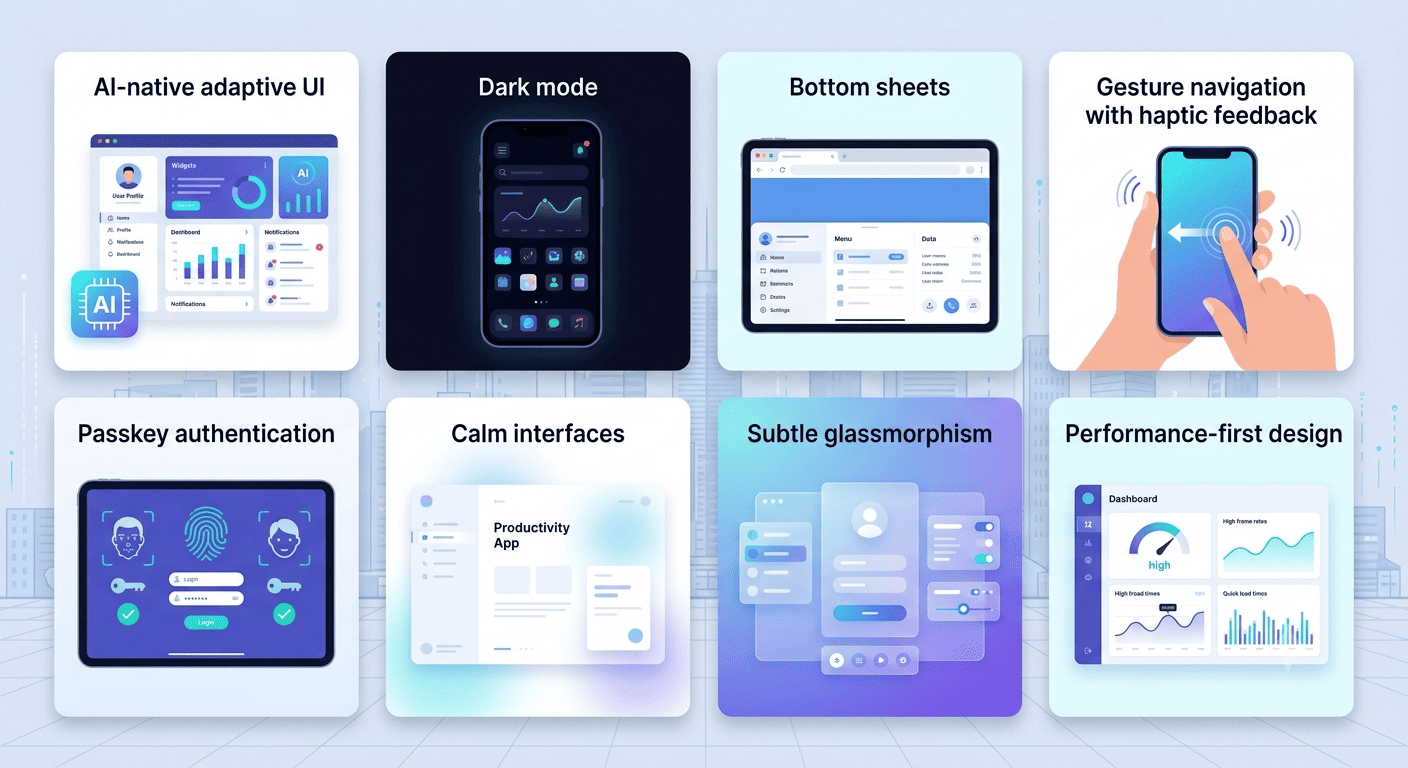
The UI design trends actually shaping 2026 are AI-native adaptive interfaces, dark mode built as a default rather than a toggle, bottom-sheet navigation for secondary content, gesture-based interaction with haptic feedback, passwordless authentication, and calm, low-stimulus layouts that prioritize speed over visual noise. The common thread across all of them is restraint. 2026’s strongest interfaces do less, not more.
Search “UI design trends 2026” and you’ll find dozens of near-identical listicles, most stacking ten or twelve trends with little sense of which ones actually matter versus which ones are filler to hit a round number. This post takes a different approach: fewer trends, more honesty about which ones are genuinely reshaping how apps get built versus which ones are getting recycled from a 2021 design blog with a new year slapped on the title.
What Makes a UI Trend Worth Adopting in 2026?
A trend worth adopting solves a real friction point for real users, not just a visual refresh that photographs well in a portfolio. The strongest 2026 trends share a specific quality: they work with physical and behavioral reality, how thumbs actually reach a screen, how eyes respond to OLED displays, how people have already learned to use gestures, instead of asking users to learn something new for its own sake.
Trend or Fundamental? A Quick Test
Not everything labeled a “2026 trend” is actually new, and confusing the two leads teams to either under-invest in something durable or over-invest in something that’ll look dated in eighteen months.
| Signal | Likely a Fundamental | Likely a Passing Trend |
| Origin | Solves a persistent, well-documented usability problem | Emerged mainly as a visual style choice |
| Platform support | Backed by a system-level API or platform convention | Achieved through custom, one-off implementation |
| Longevity | Present across multiple design eras under different names | Tied closely to a specific year’s aesthetic |
| Adoption pattern | Spreading because it measurably reduces friction | Spreading because competitors are doing it |
Dark mode and thumb-friendly layout, for instance, aren’t really “2026 trends.” They’re fundamentals that have simply become table stakes. What’s genuinely new in 2026 is more specific: how AI shapes personalization, how bottom sheets have replaced full-screen takeovers, how gesture vocabularies have matured.
The UI Design Trends Actually Shaping 2026
1. AI-Native, Adaptive Interfaces
The shift here isn’t adding a chatbot to an existing app. It’s building interfaces that restructure themselves based on behavior, surfacing what a specific user likely needs before they search for it, the way a music app’s home screen might rearrange based on listening patterns rather than showing every user an identical layout. This connects directly to the broader UI/UX design discipline of designing for real user behavior instead of a single idealized user.
2. Dark Mode as Default, Not a Toggle
Dark mode has moved past being an inverted color scheme bolted onto a light-first design. The stronger 2026 implementations design dark palettes first, with deliberately tuned contrast ratios and colorblind-safe choices, then adapt to light mode, rather than the other way around. It’s a meaningful shift in process, not just preference.
3. Bottom Sheets Over Full-Screen Takeovers
The draggable panel anchored to the bottom of the screen, standardized on iOS since UISheetPresentationController, has become the default container for settings, filters, and confirmations in 2026, replacing full-screen modals for anything that doesn’t need to fully interrupt the user’s context. It’s a small pattern shift with a real usability payoff, keeping users oriented in the flow they were already in.
4. Gesture Navigation With Haptic Feedback
Simple swipe and tap gestures have evolved into compound gesture vocabularies, swipe left to archive, long-press for options, pull down to search, each paired with subtle haptic feedback confirming the action landed. This works best when it’s consistent throughout an app, which is exactly the kind of interaction-pattern discipline covered in our thumb-friendly navigation guide.
5. Passwordless and Passkey Authentication
Biometric and passkey-based login have gone from novelty to expectation, removing the friction of remembering and typing a password entirely. Apple’s passkey documentation outlines the underlying standard well, and platform-level support on both major operating systems has made this one of the easier “trends” to actually implement, since it’s now a supported convention rather than a custom build.
6. Calm, Low-Stimulus Interfaces
As more apps compete loudly for attention, a calmer, more predictable interface has become a genuine differentiator rather than a compromise. This isn’t minimalism for its own sake. It’s a retention strategy, since interfaces that don’t exhaust users tend to get opened again.
7. Glassmorphism, Used Surgically
The translucent, blurred-panel aesthetic that first appeared years ago has returned in a more restrained form, reserved for overlays, notification panels, and media controls where the blur signals “this layer is temporary” rather than applied across an entire interface. The difference between the earlier version and the 2026 version is largely a matter of restraint, applying it purposefully rather than everywhere.
8. Performance as a Design Decision, Not Just an Engineering One
Heavy assets, complex animations, and overloaded home screens all delay the first meaningful interaction, and in 2026 that delay gets treated as a design failure, not just a technical one. Design and engineering teams increasingly make these calls together from the start, since a beautiful screen that loads slowly still loses to a plainer one that opens instantly.
Trends Worth Watching Skeptically
Full spatial computing interfaces and heavy AR overlays remain compelling in specific contexts, retail try-on experiences, immersive education, but they’re not yet a default expectation for most business apps, and building them without a clear use case tends to add cost without adding real value. Similarly, some of the flashier “AI agent” interface concepts floating around are still maturing, and betting an entire product’s interaction model on them today carries real risk if the underlying pattern shifts again before your app ships.
How to Decide Which Trends Fit Your App
Ask whether a trend solves a friction point your specific users actually experience, not whether a competitor has adopted it. A trend that improves task completion for a utility app might do nothing for a content-browsing app, and applying it anyway just adds design and engineering cost without a real payoff. This is the same judgment applied throughout our guide to mobile app UI/UX design best practices: fundamentals first, trends only where they genuinely serve the product.
Common Mistakes When Chasing UI Trends
Treating a trends list as a checklist to implement in full is probably the most common one, since not every trend fits every product, and forcing one in tends to create friction rather than remove it. Copying a competitor’s visual style without understanding why it works for their specific user base is another. And skipping the accessibility implications of a new pattern, glassmorphism’s contrast issues or gesture-only navigation with no visible fallback, tends to trade a trendy look for a real usability regression, a tension covered in more depth in our WCAG accessibility guide.
How UI Trends Connect to the Rest of Your App
Adopting a new pattern isn’t just a visual decision. It touches the design system tokens and components that need to support it consistently, and it needs to be planned during Mobile App Development rather than bolted on late, since patterns like adaptive dark mode or gesture navigation touch far more of the codebase than a single screen.
How The Apps Developers Approaches UI Design Trends
We evaluate trends against what actually improves a specific product, not against what’s currently popular. That means fundamentals get priority, and trends get adopted selectively, where they solve a real problem for real users rather than just refreshing the look of a screen. If you’re planning a new app and want a design direction that’ll hold up past this year’s trend cycle, we’re glad to help you think it through.
Conclusion
The UI trends actually worth watching in 2026 share a common thread: they reduce friction by working with how people actually hold, look at, and interact with their phones, not by adding visual flourishes for their own sake. Adopt what genuinely serves your users, treat the rest skeptically, and don’t mistake a trends list for a design strategy.
If you’re planning your next app and want a design direction built to last, get in touch. We can help you separate what’s actually worth building from what’s just noise this year.