

Good dark mode design avoids pure black backgrounds, uses lighter surface layers instead of shadows to show elevation, and maintains the same WCAG contrast ratios required in light mode. It also never gets forced on users who haven’t asked for it. Simply inverting a light interface’s colors and calling it dark mode is the most common way this goes wrong, and it’s exactly why so many “dark” apps still feel harsh to actually use.
Dark mode stopped being a nice-to-have a while ago. Most users now expect it as a baseline option, not a premium feature, and an app without it can start to feel dated by comparison. But building it well takes more than flipping a color palette. Here’s what actually holds up in real use, on real screens, not just in a mockup that looks fine in a design file.
What Is Dark Mode Design?
Dark mode design is an interface theme that uses dark backgrounds and light text and UI elements, reversing the traditional light-background convention while still meeting the same accessibility and usability standards. It’s not a cosmetic filter applied over an existing design. Done properly, it’s a separate, deliberately tuned visual system.
Dark Mode Isn’t Just Inverted Light Mode
The biggest misconception teams run into is treating dark mode as a simple color inversion, flipping white backgrounds to black and black text to white. That approach consistently produces excessive contrast, visual fatigue, and a “halation” effect where bright text appears to glow or blur against a dark background, especially noticeable for users with astigmatism. Building dark mode properly means treating it as its own considered palette, with its own contrast tuning, not a filter run over the light version.
True Black vs. Dark Grey: Which Should You Use?
This is one of the most common early decisions, and getting it wrong shows up immediately in user comfort.
| Factor | Pure Black (#000000) | Dark Grey (around #121212) |
| Battery impact on OLED | Maximum savings, since the pixel turns fully off | Still meaningful savings, slightly less than pure black |
| Contrast with white text | Very high, can cause eye strain and halation | Softer, generally more comfortable for extended reading |
| Elevation and depth | Hard to express, since there’s no darker option below it | Easier, since lighter surface layers can sit above it |
| Best fit | Media-heavy, short-session apps like video or photo viewers | Most general-purpose apps, especially text- and UI-heavy ones |
The consensus across current design guidance is fairly consistent: dark grey is the safer default for most apps, and pure black gets reserved for specific cases where maximum contrast and battery savings genuinely matter more than everyday reading comfort.
8 Best Dark Mode Practices for Mobile and Web
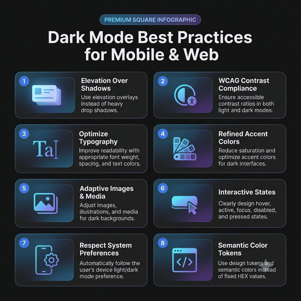
1. Use Elevation Overlays Instead of Shadows
Shadows barely register against a dark background, which means the usual way light-mode interfaces show depth simply stops working. Instead, use progressively lighter surface layers, subtle white overlays in the 5 to 10 percent opacity range, to indicate that a card, modal, or dropdown sits above the base layer, an approach Google’s Material Design dark theme guidelines document in detail. Think of it as designing with light sources rather than shadows.
2. Maintain WCAG Contrast Ratios in Both Modes
The same WCAG minimums apply regardless of theme, 4.5:1 for normal text, 3:1 for large text and non-text UI elements. Dark mode commonly fails this not because teams ignore contrast entirely, but because they assume light text on a dark background automatically passes, when interactive states, secondary text, and icons often fall short without a deliberate check. Tools like WebAIM’s Contrast Checker make this straightforward to verify before shipping.
3. Adjust Typography for Dark Backgrounds
Text that looks crisp in light mode can appear thinner and slightly blurred against a dark background, an effect tied to how light bleeds on OLED screens. A modest increase in font weight, along with slightly more generous line height and letter spacing, tends to restore the readability that gets lost in the switch.
4. Desaturate and Adjust Accent Colors
Fully saturated colors that read fine in light mode can appear to vibrate or bleed against a dark background. Slightly desaturating brand and status colors, and using lighter tints where needed, keeps accents legible without the visual buzz that undermines an otherwise clean interface.
5. Adapt Images and Media
Bright, high-key photos jar badly against a dark interface. A subtle brightness and contrast adjustment applied specifically in dark mode, rather than showing the same unmodified image across both themes, prevents that jarring “light bombing” effect.
6. Design Every Interactive State Explicitly
Hover, focus, active, and disabled states get tested carefully in light mode and then quietly left broken in dark mode more often than teams expect. Each state needs its own explicit dark mode specification, not an assumption that it’ll inherit correctly from the light version.
7. Respect System Preference, Never Force It
Defaulting to the user’s system-level theme setting, while still offering a manual override, respects a choice the user has already made elsewhere on their device. Forcing dark mode on everyone, or forcing light mode on users who’ve deliberately set their system to dark, both create unnecessary friction for something that should just work automatically.
8. Use Semantic Color Tokens, Not Fixed Hex Values
Defining colors as roles, background-primary, text-secondary, surface-elevated, rather than hardcoded hex values, is what makes a dark theme maintainable at scale. This is the same token-first discipline covered in our design systems for startups guide, and it’s what separates a dark mode that scales cleanly from one that requires manual fixes every time a new screen ships.
Battery Savings: How Real Is the Benefit?
The savings are real on OLED and AMOLED displays, where each pixel is its own light source and a black pixel effectively turns off, but the size of that benefit varies quite a bit depending on screen brightness and how much of the interface is actually dark. On traditional LCD screens, where a backlight stays on regardless of what’s displayed, there’s essentially no battery benefit at all. Treat battery savings as a genuine but secondary benefit, not the primary reason to build dark mode well.
Common Dark Mode Mistakes
Using pure black as a default background is one of the most frequent, since it creates the exact contrast and halation problems careful dark mode design is meant to avoid. Applying dark styling only to backgrounds while leaving icons, charts, and images untouched is another, producing an interface that looks half-finished. Skipping a transition animation between themes makes the switch feel abrupt rather than polished, and treating accessibility as something already solved in light mode, without separately verifying contrast in dark mode, is a gap that shows up constantly in real audits.
How Dark Mode Connects to the Rest of Your App
Dark mode isn’t an isolated feature. It’s tied directly to the same design system tokens that govern the rest of an interface, and getting it right is one of the fundamentals covered in our broader look at UI design trends, where dark mode has moved from trend to baseline expectation. Building it properly during initial Mobile App Development is far less costly than retrofitting a considered dark theme onto an app that was only ever designed with light mode in mind.
How The Apps Developers Approaches Dark Mode Design
We build dark mode as its own considered palette from the start, not a color inversion applied late in the process. That means elevation, contrast, typography, and every interactive state get designed deliberately for dark backgrounds, as part of the same UI/UX design work that shapes the rest of the app. If your current dark mode feels like an afterthought, or you’re planning one from scratch, we’re glad to help you get it right.
Conclusion
Dark mode design done well is a deliberate, separately tuned system, not a quick color inversion. Avoid pure black as a default, maintain real contrast discipline, adjust typography and media for dark backgrounds, and let users control which theme they see. Get those fundamentals right, and dark mode becomes one of the more noticeable signals that an app was actually built with care.
If your dark mode needs a real audit, or you’re planning one from the ground up, get in touch. We can help you build it properly the first time.